

My First Regression Model :)
let me take you on a tour of my regression model to predict the housing price(Chennai Dataset)


Table of contents
My little Story to start who this @yooFunMan
who am I?
That's a great question, I'm a self-taught programmer(I'm still and will be in the future) from India.
The Movie that made me start on the machine learning practitioner journey :0
Can you guess? Well, you don't even have to think that hard ... it all started from Iron Man Movie. And even though it's an imaginary character thanks to Stan Lee.
I was inspired by how that Tony Stark character can learn from anything.
And also the way he uses his AI butler jarvis to make his day Easier. So it started me to think, can I build one AI system(aka Ai model) that can do all the things (AND MORE)just like in the Movie?.
Well Guess What!! ... You/We can .. ; ) But not similarly like in the movie but still, we can get close to the point of making a model that can learn on its own.
I do have a lot of stories.. but I get it it's not why you clicked on this blog.. so let's don't waste any more of your precious time and let's jump into the wonders world of machine learning
The Regression Model Journey
Now In this blog, I'm going to quickly go through how I did a Regression model which can learn from the given information about the houses and predict let's say the house's worth. It may sound complicated at the first time (If you're new to the machine learning field). But it's way more fun and easier than you think.
""its all about visualize visualize visualize""
Wait a minute visualize ..... what ... >?.
You mostly spend half of your time visualizing your data... Don't worry about that for now...
let's go through the following stuff I went through to find the optimal solution for this problem
Getting the Data Ready

import pandas as pd
from datetime import datetime
parser = lambda x:datetime.strptime(x,'%d-%M-%Y')#this parser is optional we can use this for complex date and time
df = pd.read_csv("/content/drive/MyDrive/Datasets/Chennai houseing sale.csv",parse_dates=["DATE_SALE","DATE_BUILD"],date_parser=parser)
df.head(1).T
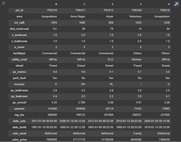
With these few lines of code, we can easily get our Data to a Pandas Dataframe.
Now, What is Panda That could actually take a whole another blog to define it. (ForeShadowing )
But in a short line pandas is a software library written for the Python programming language for data manipulation and analysis
- Getting the null values out ;)
Get out Null Values Nobody Needs you :(
I know I'm being a little harsh to the null values but it's not I wanted to be a bad guy but our model cannot learn from the null values (No Values)
By this point, I'm going to name my model = (Robert)
It is always great to call ("_") our AI with a name ;)
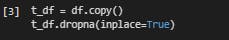
t_df = df.copy()
t_df.dropna(inplace=True)
Explaining the above code
- I first create a dummy dataset(t_df) from our original df (data set). with help of a single function called
copy() - Then I dropped any NA (Null) values from the dataset. with a help of a single line function
dropna()
- Getting the columns in the right manner (For me)

# lets rechange the index values
t_df.columns = t_df.columns.str.lower()
t_df=t_df.reindex(columns=["prt_id","area","int_sqft","dist_mainroad","n_bedroom","n_bathroom","n_room","buildtype","utility_avail",
                           "street","qs_rooms","park_facil","mzzone",
                            "qs_bathroom","qs_bedroom","qs_overall","commis","reg_fee","date_sale","date_build","sale_cond","sales_price"])
t_df.head().T
Explaining the above code
- I first changed my UPPERCASE letters in columns into lowercase letters
- Then I changed the order of the columns which made sense to me
- Changing Any Spelling mistakes in the dataset
t_df.area = t_df.area.replace({"Chrmpet":"Chrompet",
                   "Chrompt":"Chrompet",
                   "Chormpet":"Chrompet",
                   "KKNagar":"KK Nagar",
                   "Velchery":"Velachery",
                   "Ana Nagar":"Anna Nagar",
                   "Ann Nagar":"Anna Nagar",
                   "Adyr":"Adyar",
                   "Karapakam":"Karapakkam",
                   "TNagar":"T Nagar"})
t_df.area.value_counts()
Output :
Chrompet      1691
Karapakkam    1359
KK Nagar       990
Velachery      975
Anna Nagar     777
Adyar          769
T Nagar        495
Name: area, dtype: int64
Explaining the above code
- Using the padas
replace()function to change my columns into a right spelling - With the help of
value_counts()Visualizing the data I changed
- Changing all the strings into lower case
t_df = t_df.astype(str).apply(lambda x: x.str.lower())# by using this function we are changing the datetime into object which is string just to remember :0
Explaining the above code
- Applying the
astype()function which changes the datatype of the data which is (int or string or boolean .. etc...) - Applying the
lambda()function which is like a single line of functional code that helps to make the str into lower
- Creating a function to change the numerical datatype into int(integer)
def change_dtype(columns):
  for column in columns:
    t_df[column] = t_df[column].astype(float).astype(int)
- Changing the following columns into integer format
columns = ["int_sqft","dist_mainroad","n_bedroom","n_bathroom","n_room","qs_rooms","qs_bathroom","qs_bedroom","qs_overall","commis","reg_fee","sales_price"]
change_dtype(columns)
Visualizing the data
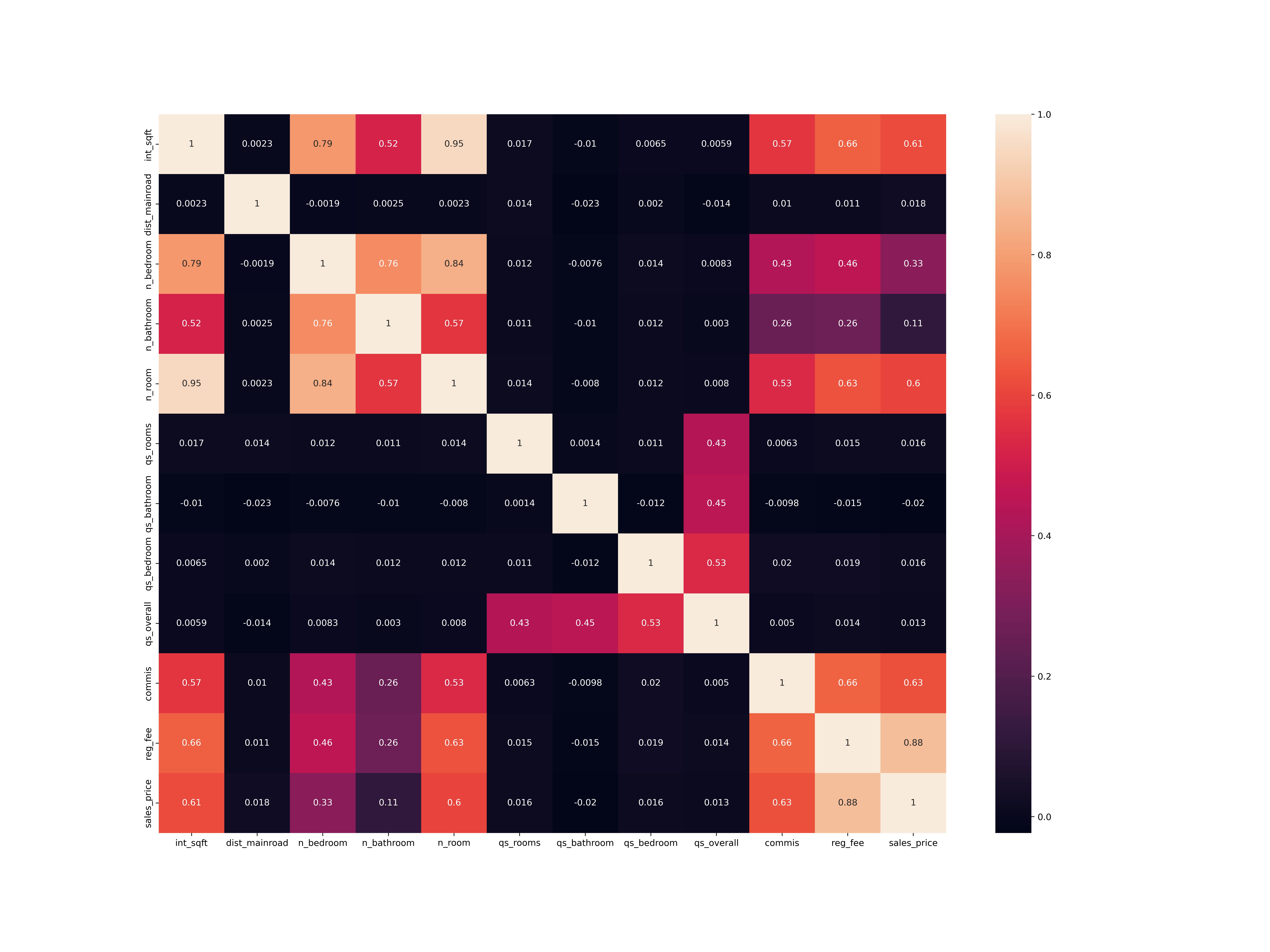
import seaborn as sb
import matplotlib.pyplot as plt
plt.figure(figsize=(20,15),dpi=150)
sb.heatmap(t_df.corr(),annot=True)
Output:
Explaining the above code
- We first import
seabornlibrary as sb its a Python data visualization library based on matplotlib. - Then We install matplotlib which is also a data visualizer on its own .
- now we use seaborn
heatmap()to view the data correlation
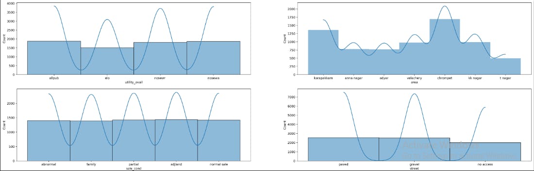
-visualizing the categorical values
plt.figure(figsize=(30,25),dpi=500)

plt.subplot(5,2,1)
sb.histplot(t_df.utility_avail,kde=True)

plt.subplot(5,2,2)
sb.histplot(t_df.area,linewidth=0,kde=True)

plt.subplot(5,2,3)
sb.histplot(t_df.sale_cond,kde=True)

plt.subplot(5,2,4)
sb.histplot(t_df.street,kde=True)

plt.subplot(5,2,5)
sb.histplot(t_df.buildtype,kde=True)
Output :
You see In Integer data we have two types
- Continuous numerical values
- [Discrete values] (mathsisfun.com/data/data-discrete-continuou..)
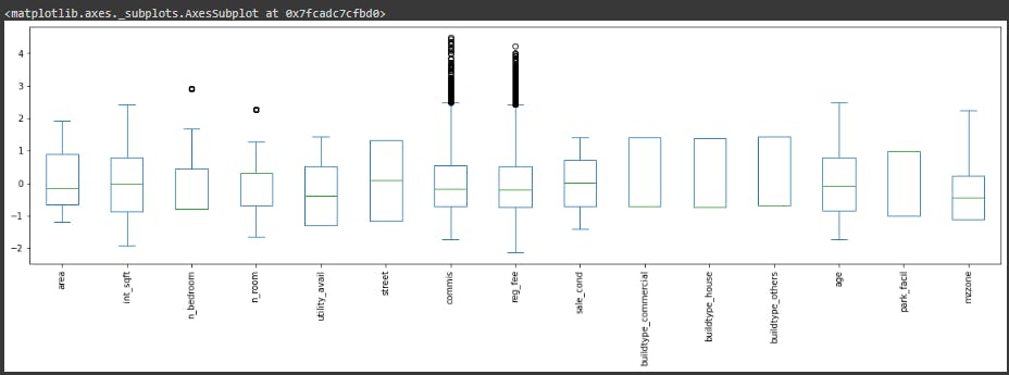
- The following codes to plot the numerical values
#lets create a function to do this plot
def plot_all_numeric_values(columns):
  for i,column in enumerate(columns):
    plt.subplot(15,2,i+1)
    sb.distplot(t_df[column])
    print(f"the {i+1} is = {column}")

columns = ["int_sqft","dist_mainroad","n_bedroom","n_bathroom","n_room","qs_rooms","qs_bathroom","qs_bedroom","qs_overall","commis","reg_fee","sales_price"]

plt.figure(figsize=(30,30),dpi=500)
plot_all_numeric_values(columns)
Output:
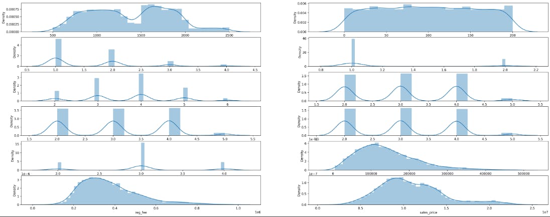
Explaining above code
- I used another seaborn function called
distplot()
- Visualizing Continuous numerical Value
def create_regplot(columns,standard_values="sales_price"):
  for i,column in enumerate(columns):
    plt.subplot(10,2,i+1)
    sb.regplot(x = t_df[column],y = t_df[standard_values],scatter_kws={"color":"green"},line_kws={"color":"red"})

fig = plt.figure(figsize=(30,40),dpi=340)

columns = ["reg_fee","int_sqft","commis","dist_mainroad"]
create_regplot(columns)
Output:
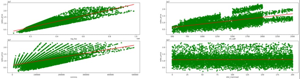
- Visualizing Discreate numerical value
columns = ["n_bedroom","n_bathroom","n_room","qs_rooms","qs_bathroom","qs_bedroom"]
plt.figure(figsize=(30,30))
create_regplot(columns)
Output
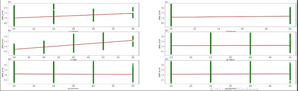
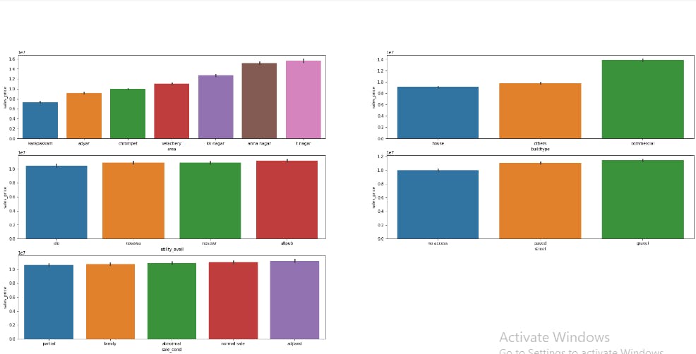
- Plotting categorical vs salesprice values
def plot_cat_vs_sales(columns,s_v = "sales_price"):
  for i,column in enumerate(columns):
    plt.subplot(10,2,i+1)
    sb.barplot(x=t_df[column],y=t_df[s_v],order=t_df.groupby(column)[s_v].mean().reset_index().sort_values('sales_price')[column])#its not clear for me to ... (past sriram:))

  plt.suptitle("categorical Vs SalesPrices",fontsize=20)
  plt.show()

plt.figure(figsize=(30,45))
columns=["area","buildtype","utility_avail","street","sale_cond"]
plot_cat_vs_sales(columns)
Output :
Encoding Some Values
Our computers cant understand categorical values as we do. So Here Comes the two major encoder in our hands OneHot and Label .
This blog post made this thing easier to understand get our hands on it towardsdatascience.com : label-encoder-and-onehot-encoder
- OneHot Encoding
import pandas as pd
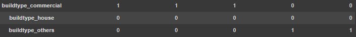
t_1_df = pd.get_dummies(t_df,columns=["buildtype"])
t_1_df.head()
Output:
- Label Encoded
t_1_df.area = t_1_df.area.map({"karapakkam":"2","chrompet":1,"kk nagar":3,"velachery":4,"anna nagar":5,"adyar":6,"t nagar":7})
t_1_df.utility_avail = t_1_df.utility_avail.map({values[0]:1,values[1]:2,values[2]:3,values[3]:4})
t_1_df.street = t_1_df.street.map({"paved":1,"gravel":2,"no access":3})
t_1_df.sale_cond = t_1_df.sale_cond.map({"adjland":1,"partial":2,"normal sale":3,"abnormal":4,"family":5})
t_1_df.park_facil = t_1_df.park_facil.map({"yes":1,"no":0,"noo":0})
t_1_df.mzzone = t_1_df.mzzone.map({"rl":1,"rh":2,"rm":3,"c":4,"a":5,"i":6})
Output:
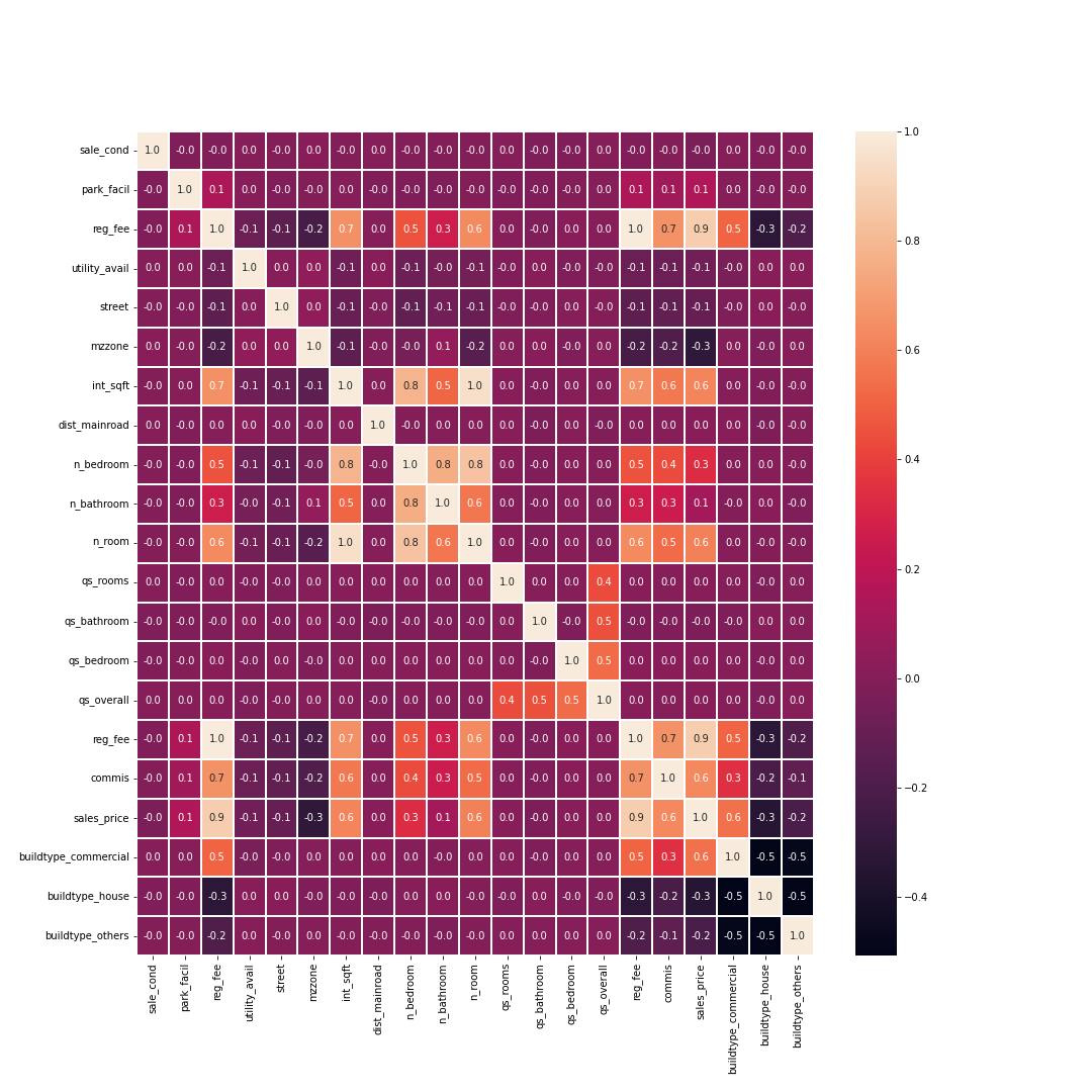
- Now Again Visualizing the dataset with seaborn heatmap()
plt.figure(figsize=(15,15))
sb.heatmap(t_1_df.corr(),annot=True,linewidths=1,fmt=".1f")
Output:
Normalization
Normalization in machine learning is the process of translating data into the range [0, 1] (or any other range)
Normalizing the data
#ok before go through the normalizing the data we need to change the datetime into int
t_2_df["age"] = t_2_df.date_sale.dt.year - t_2_df.date_build.dt.year
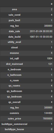
t_2_df.head().T
Output:

- let's reduce/delete the date columns becoz now we have an age column
t_2_df = t_2_df.reindex(columns=["area","int_sqft","n_bedroom","n_room","utility_avail","street","commis",
                                 "reg_fee","sale_cond","buildtype_commercial","buildtype_house","buildtype_others","age","sales_price",
                                 "park_facil","mzzone"])
t_2_df.head().T
Let's Split Our Data Into Train and Test split
from sklearn.model_selection import train_test_split
X = t_2_df.drop("sales_price",axis=1)
Y = t_2_df["sales_price"]
x_train,x_test,y_train,y_test = train_test_split(X,Y,test_size=0.2)
The Above Coding Explained
- We first import
sk-learnlibrary. Scikit-learn (Sklearn) is the most useful and robust library for machine learning in Python
- What is a train and test set ...In one word its splits our features into two types
In the Training set which we use to train our model and in the test set we use it to test our model
Let's Normalize our numerical data
from sklearn.preprocessing import StandardScaler
SS = StandardScaler()
SS.fit_transform(x_train)
x_train_SS = SS.transform(x_train)
x_test_SS = SS.transform(x_test)
Output : )
Lets Create A Robert AI :)
And Wow It Took a really long time to just visualize our data points ...
So now the Really interesting part of all the work we done ......
from sklearn.ensemble import RandomForestRegressor
m = RandomForestRegressor()
m.fit(x_train_SS,y_train)
m_pred = m.predict(x_test_SS)
from sklearn.metrics import r2_score
r2_score(y_test,m_pred)
Output :
the output:0.9763829465078139
- With GradientBoostingRegressor
from sklearn.ensemble import GradientBoostingRegressor
robert_SS = GradientBoostingRegressor(learning_rate=0.5)
robert_SS.fit(x_train_SS,y_train)
robert_SS_predict = robert_SS.predict(x_test_SS)
from sklearn.metrics import r2_score
SS_score = r2_score(y_test,robert_SS_predict)
Output:
the output:0.9946639995600735
OH MY GOD would you look at that !!!!!! Our little Robert Had learned our data very well and now he is ready to go out to the world and apply what he learned to real-world problems
And Guess what this is my first time trying to do a real-world problem in the machine learning field too. :)
I'm so proud of Robert for the way he becomes
Our Robert Feature Importance
from sklearn.inspection import permutation_importance
pe_im = permutation_importance(robert_SS,x_test_SS,y_test)
index = pe_im.importances_mean.argsort()
plt.barh(t_2_df.columns[index],pe_im.importances_mean[index])
Output:
![featureimportanceSSmodel%[Link].png](https://cdn.hashnode.com/res/hashnode/image/upload/v1657718253071/eZ5XOmdRt.png?auto=compress,format&format=webp)
These are all of the features our Robert AI is taken to learn a pattern from our data
Conclustion:
After all the work, we have a Robert AI which has 99% accurate in our predictions :)
Now How did I Learn't all this ? ... that's a great question too...
That story is For Another blog ...
But Really thank you to all of you who read this so patiently :).And Let me know if you want an in-depth analysis of this project
BYE TAKE CARE :)
The above code is available on My Github : @sriram403
My Linkedin profile : @sriram